


| Rail fares heat map? Posted by Mark A at 11:58, 18th April 2026 |     |
Rail fares not being calculated based on a flat-rate per-mile basis, has anyone created some sort of UK-wide heat-map for this? There'd be the need to exclude advance fares as the availability of those is at the discretion of... I'm not sure who. Also, possibly, a filter to exclude return tickets as those are fading away. Perhaps a heat map of this isn't actually possible. The results would be colourful though - the ex-Network Southeast area discernable at a glance, perhaps. Ditto, TfL. Also, how would the Welsh and Scottish borders manifest themselves? And would certain stretches of line light up particularly brightly? Locally, the Severn Beach line might glow a welcoming green, while Bristol to Bath, Didcot to Swindon, an angry red.
Mark
| Re: Rail fares heat map? Posted by Mark A at 12:04, 18th April 2026 | |
| Re: Rail fares heat map? Posted by grahame at 13:38, 18th April 2026 | |
I have had a play. Top image is how far I can get, single superest off peak from Melksham for £50. Lower image is peak costs from Melksham, no fare limit.
The black lines show where is suggested to split - however, since you have to use a train that calls at those stations you're going to be in for multiple changes and a s-l-o-w trip at times, if it's even possible. Split at Royal Oak?? Split at Ashchurch and at Worcestershire Parkway - are there direct trains between them for you, or is that a "change at Foregate Street" job? If you follow the peak split ideas, it will be long after the peak you get to your destination. It also appears to miss some of the options that are more obscure than a split. An interesting graphic which helps make suggestions of where to look.
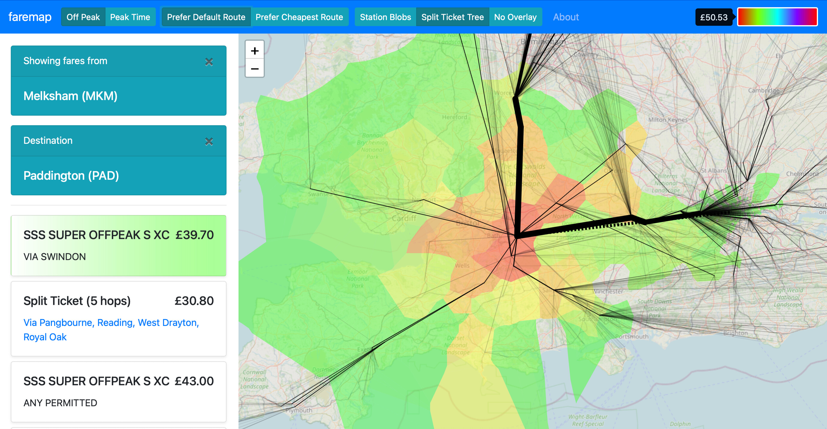
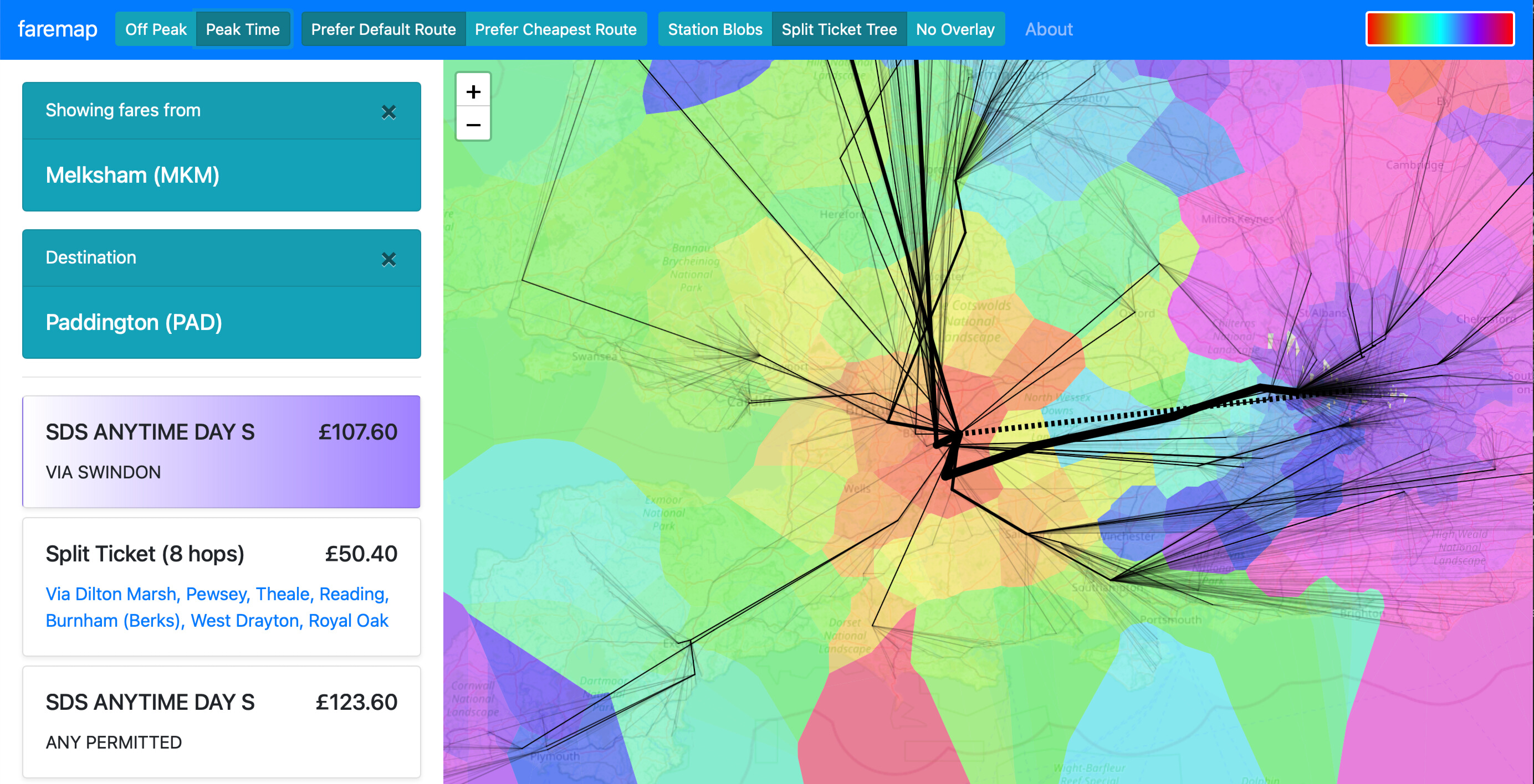
The colour scale, with orange and yellow being lowest cost, through green in the middle the up through blue to red confused me at first, as I would expect orange to be close to red ...
